The logo is the face of the brand and it is the most recognizable part of the business. Trends in logo creation change regularly. In order for the company’s logo to withstand modern competition, it must stand out favorably against the background of other logos. A successful and modern logo can increase the company’s recognition, which in turn will affect demand, and this factor can significantly increase the company’s profit.
It is possible to identify certain trends that can be traced in this year, both in the creation of new logos and the updating of well-known logos of the world’s largest companies.
The return of the 90s
Logo by Jeremy Vessey
Neon colors, bold contrasts, unusual shapes – the 90s are back. Do you want to modernize the logo? Add a bold shadow, choose a non-standard font or paint the logo in all the colors of the rainbow.
Choosing the style of the 90s for the identity, it is worth remembering two points. Firstly, align it with the brand image: it is more suitable for companies with a bright, rebellious, youth character. Secondly, make sure that the variety of colors and complex shapes will look good in small formats: as an icon of a mobile application or an avatar in a social network. To make the logo creation process easy, you can try out cloud logo creation tools such as free logo maker by adobe.
Gradients
Logo by Izaz Mahammad
This trend is not a novelty, but it is still actively used when creating logos. It is present in all aspects of the design (backgrounds, site layers and logos). Gradient is a design technique during which colors are mixed. An important trend in 2022, when using this technique, is smoothness and delicacy.
This trend gives colors to both new and updated logos, while allowing you to conduct quite bold experiments that will be accurately appreciated by the end consumer.
Using different fonts
Logo by Alex Seciu
The usual font change allows you to completely change the visual perception of the text logo. At the same time, this trend contains many different variations, namely:
– Increase or decrease of certain letters or the entire inscription itself,
– Creation of various geometric shapes from the text,
– Different letter heights,
– Reducing or increasing the thickness of certain lines.
This is a rather incomplete list of what can be done when using this method of creating or updating a logo. However, it is necessary to maintain a certain balance between creativity and marketing in order for the right message to reach the buyer.
Using noticeable colors
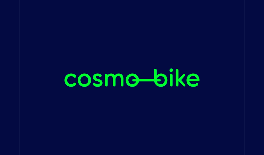
Logo by Vlad Smolkin
This logo should be the first to be seen by the end user. Such a logo may not be of interest to him at the moment, but it will definitely be deposited in his memory on a subconscious level, which ultimately, at the right time, will allow him to make a choice in favor of this logo (brand).
This trend also allows you to profitably update an existing brand. It will make it fresher and also much more noticeable. At this time, people spend little time interacting with logos and symbols. That is why it is necessary to attract their attention at any cost, and a bright logo is exactly what is best to cope with this task.
3d logo design

Logo by Izaz Mahammad
In 2022, 3D logos acquire a new, improved identity. Using beveled corners, blurred edges and gradients can greatly enhance your logo. In addition, it is a great way to attract the attention of site visitors. To make the logo look modern, make it light and minimalistic, and leave it only as part of the main design.
Like other trends, a 3D logo may not suit everyone, it is necessary to take into account the industry in which you work, as well as its unique capabilities, brand identity and the general message that you want to convey. A 3D logo can stand out favorably on the screen and add personality to the Internet image. If the logo appears mainly on printed materials, three-dimensional details may get lost or completely disappear from the design.
Drawn by hand
Logo by Jesse Bowser
Such a logo cannot be repeated, nor can it be confused with any other logo. A hand-drawn logo is ideal for various creative studios and already at the logo stage will allow customers to understand that this company is truly unique and creative, and will also perfectly cope with even the most difficult tasks.
At the same time, the logo can be made carelessly, which will give it naturalness, or on the contrary, all the lines can be made perfectly, which will make it more premium.
Conclusion
One way or another, all modern trends in creating logos are aimed at attracting additional attention to the logo, as well as at making it stand out favorably among competitors. The logo is the face of the company and the interest of customers in the company’s products or services may depend on how well and interestingly it is executed, which will ultimately affect the final profit. Also, do not forget that a successful and interesting logo can be discussed by end consumers, both on the street and in various social networks, which in turn will become a free advertisement for the brand and the products (services) provided.